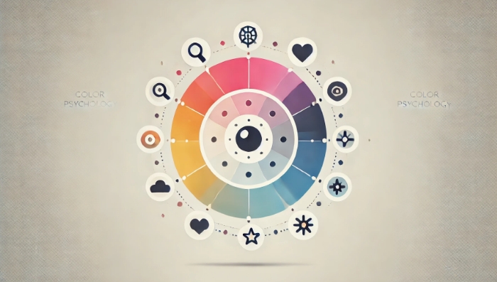
Harnessing color psychology can be transformative for web design. The strategic use of color does more than just make a website visually appealing—it subtly influences user perception, decision-making, and engagement. From highlighting essential calls to action to building a cohesive brand identity, colors can serve as invisible guides that lead users to engage more deeply with your site. Here are some practical, effective ways to apply color psychology and make your web design resonate with your audience.
Align Colors with Brand Identity
Every brand has a personality, and colors should be chosen to reflect that personality. For example, a wellness brand might lean towards greens and blues to reflect tranquility and trustworthiness, while an entertainment brand could incorporate vibrant reds and oranges to communicate excitement.
Use Colors to Guide User Attention
By assigning specific colors to buttons, links, and calls to action (CTAs), you can guide users to take specific actions on your site. Bright, contrasting colors are particularly effective for CTAs, as they stand out and draw users’ attention to key conversion points.
Consider Cultural Differences
Colors have different meanings across cultures, so it’s essential to consider your target audience. For instance, red can represent good luck and happiness in some cultures, while in others, it may be associated with caution or warning.

Create Emotional Connections
Emotions are powerful motivators, and colors can be used to create emotional responses that align with your brand’s message. For example, a financial services website might use blue to communicate stability and trust, helping users feel confident in their choice.
Maintain Readability and Contrast
A visually appealing design is essential, but readability is even more crucial. Ensure that text color contrasts well with background colors to make content easy to read. This not only improves accessibility but also enhances user experience.
Apply Color Consistently Across the Site
Consistent use of color strengthens brand recognition and creates a cohesive look. Define a color scheme for your brand that includes primary, secondary, and accent colors, and apply them consistently across all pages and elements on your site.
Use White Space for Balance
White space, or negative space, is the area of a design without any content. It helps balance the page, reduces visual clutter, and lets important elements stand out. White space can also enhance the psychological effects of your chosen colors by making them feel less overwhelming.
Thoughtful color choices are a powerful part of any successful web design, helping guide users, evoke the right emotions, and reinforce brand identity. By understanding and applying these principles, you can create a website that not only looks visually compelling but also achieves specific business goals by engaging users on a deeper level. Embracing these strategies will help you design a site that is not only memorable but also impactful in its ability to communicate and connect.
发表回复